Create once, publish everywhere
When I joined adidas four years ago, I found myself in the most exciting environment I had ever experienced as a software engineer. I was leading a team building tailored e-commerce experiences for artists with high demand and short-lived drops — campaigns that needed to look flawless and go live across multiple platforms at once.
When a drop happens, it hits the Android app, iOS app, and web — and most users hear about it first through email. That’s four platforms, all needing to deliver a consistent, high-quality experience at the exact same moment.
So how can content like this be created once and delivered everywhere — without a single developer touching a release pipeline, and without a single deploy — while still looking exactly like the designers dreamed it?
The answer lies in the system that empowers marketers to build and publish full campaigns end-to-end in just minutes — no developers, no deploys, no delays.
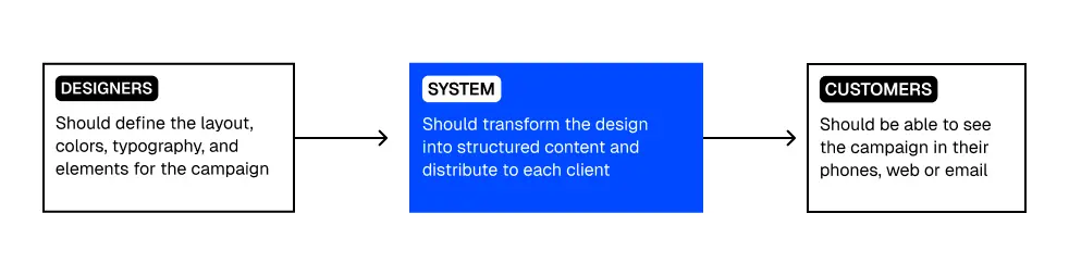
Let’s take a closer look at what it takes to build such a system — and how its architecture can unlock speed, consistency, and scalability across all platforms.
First things first: design to code, or almost code
Let’s break down how we can implement the system on the image above.
First, we need to transform the design into something that can be consumed by all platforms. The goal is to create a JSON structure, or better yet, a Domain-Specific Language (DSL) that represents UI elements in a standardized way. This DSL describes exactly how each element should behave across multiple platforms.
For example, let's look at a simple button element in our DSL:
{
  "element": "Button",
  "value": "Sign up",
  "style": {
    "background": "black",
    "color": "white",
    "padding": "10px 20px",
    "borderRadius": "5px"
  }
}
How This Would Work Across Platforms:
Web:
The button would render with the background color, text color, and padding as described.
You could add extra properties for hover states and other interactivity:
"state": {
  "hover": {
    "background": "darkgray"
  }
}
Actions like "onClick" would be included in the JSON structure too, allowing the system to render buttons dynamically and trigger the correct actions.
iOS & Android:
The structure is essentially the same, but we might need to consider native differences. For example:
iOS buttons tend to have a more native feel with shadows, and iOS might prefer cornerRadius instead of borderRadius.
Android might use a backgroundTint instead of just a color.
We’d tweak the style object slightly to account for platform-specific needs. The value and other text attributes, however, would be exactly the same.
Email:
Email clients don’t have the same level of interactivity, so the button’s appearance will be simplified. The hover state is usually not supported, so we would simply omit that.
The button would also need to be optimized for compatibility with various email clients, so we may need to rely on inline styles.
Platform-Specific Tweaks:
While the core structure remains the same, each platform might need platform-specific adaptations:
| Platform | Adaptation | Interaction |
|---|---|---|
| Web | CSS-like styles with hover, focus, and active states. | Event handlers like onClick or onSubmit are specified in the actions property. |
| iOS/Android | Native controls with platform-specific styles like shadows, rounded corners, and platform gestures. | Tied to native actions such as onTap for iOS and Android, abstracted as onAction in JSON (e.g., tap or click). |
| Inline styles with limited interactivity but rich, styled content. | No dynamic actions; interaction typically triggers a simple link (href) or email-based action. |
Creating other elements
Now do the same for paragraphs, images, videos, and many other elements that will appear in our way. You'd quickly realize there are too many manual modifications, standards to be discussed, and tons of overhead.
Every element needs its own unique set of styling rules—images need dimensions and aspect ratios, videos need media queries and play controls, and paragraphs need font sizes, line heights, and spacings defined. That’s a lot of redundant, manual work if we’re trying to define them across web, iOS, Android, and email platforms. Each time, we’d have to come up with a set of properties and behaviors that work for each platform while ensuring the end result is aligned with the designers’ vision.
This is where the challenge of scaling this system gets tricky.
Instead of re-creating the wheel every time, we could use a battle-tested DSL or layout engine that’s already been optimized for flexibility and cross-platform compatibility. Enter Yoga, Meta’s flexible layout engine (check it out here: Yoga on GitHub).
Yoga is designed to handle all the defaults and common behaviors we’re trying to define with the button example we discussed earlier. Instead of manually creating every style and property for each element—buttons, images, paragraphs, videos, and so on—Yoga allows us to define a single layout system that works consistently across all platforms (iOS, Android, Web).
Yoga offers:
-
Flexbox-based layout: This is key to responsive designs, allowing the system to manage spacing, alignment, and layout with minimal effort across all platforms.
-
Cross-Platform Compatibility: It integrates seamlessly with React Native (for iOS and Android), the web, and even email clients, reducing the need for platform-specific tweaks.
-
Standardized properties: With Yoga, properties like flexDirection, justifyContent, alignItems, and alignSelf work the same way across all platforms, meaning the layout behavior remains consistent.
-
Scalability: As new UI components and content types get added (images, videos, text blocks), Yoga handles them in a consistent and predictable way, minimizing the amount of manual work required.
By using Yoga (or a similar battle-tested layout engine), we reduce the complexity and overhead that comes with managing a large, multi-platform UI system.
Design-to-Render System: From Sketch to Screen
Once we have our layout engine figured out, the next step is to think about how the UI content actually gets authored and delivered.
Let’s break this flow into four parts:
-
Design Phase: Everything starts with design. A designer creates a campaign, usually using tools like Figma or Sketch. This includes structure (layout), style (colors, fonts), and content (text, images, buttons).
-
Transformation to JSON (DSL): This design needs to be translated into a platform-neutral format — ideally, JSON. This JSON is the blueprint of the UI: what elements appear, in what order, with what styles and behaviors. Some companies write custom tools to convert Figma designs into JSON structures, or even let designers author content directly into a CMS with UI controls.
-
CMS + Publishing System: The content and layout JSON are stored in a headless CMS (or any content backend). When a drop or campaign needs to go live, the CMS publishes the JSON, making it available via API.
-
Clients Render the UI: The client apps (iOS, Android, Web, Email) fetch the JSON, and use something like Yoga to render it natively. This allows the campaign to show up exactly as intended, across every platform, without code deployments.
Let's see a fake scenario, imagine the following campaign:
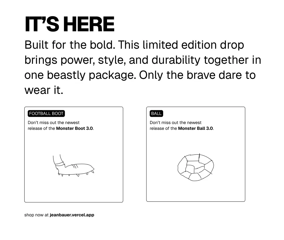
This is what the JSON could look like:
{
  "type": "container",
  "direction": "vertical",
  "spacing": 24,
  "children": [
    {
      "type": "text",
      "text": "IT’S HERE",
      "style": {
        "fontSize": 32,
        "fontWeight": "bold",
        "textAlign": "center"
      }
    },
    {
      "type": "text",
      "text": "Built for the bold. This limited edition drop brings power, style, and durability together in one beastly package. Only the brave dare to wear it.",
      "style": {
        "fontSize": 18,
        "textAlign": "center",
        "maxWidth": 600,
        "marginHorizontal": "auto"
      }
    },
    {
      "type": "container",
      "direction": "horizontal",
      "spacing": 16,
      "justifyContent": "center",
      "children": [
        {
          "type": "card",
          "width": 340,
          "height": 320,
          "border": {
            "color": "black",
            "width": 1,
            "radius": 8
          },
          "padding": 16,
          "children": [
            {
              "type": "text",
              "text": "FOOTBALL BOOT",
              "style": {
                "fontSize": 20,
                "fontWeight": "bold"
              }
            },
            {
              "type": "text",
              "text": "Don’t miss out the newest release of the Monster Boot 3.0.",
              "style": {
                "fontSize": 16,
                "marginTop": 8
              }
            },
            {
              "type": "image",
              "url": "https://example.com/boot1.jpg",
              "style": {
                "marginTop": 12,
                "height": 160,
                "objectFit": "cover"
              }
            }
          ]
        },
        {
          "type": "card",
          "width": 340,
          "height": 320,
          "border": {
            "color": "black",
            "width": 1,
            "radius": 8
          },
          "padding": 16,
          "children": [
            {
              "type": "text",
              "text": "FOOTBALL BOOT",
              "style": {
                "fontSize": 20,
                "fontWeight": "bold"
              }
            },
            {
              "type": "text",
              "text": "Don’t miss out the newest release of the Monster Boot 3.0.",
              "style": {
                "fontSize": 16,
                "marginTop": 8
              }
            },
            {
              "type": "image",
              "url": "https://example.com/boot2.jpg",
              "style": {
                "marginTop": 12,
                "height": 160,
                "objectFit": "cover"
              }
            }
          ]
        }
      ]
    },
    {
      "type": "text",
      "text": "shop now at jeanbauer.vercel.app",
      "style": {
        "fontSize": 16,
        "textAlign": "center",
        "marginTop": 32,
        "fontStyle": "italic"
      }
    }
  ]
}
There are few ways this can be transformed into JSON:
- manually
- with some plugin like figma to json
- or... AI
For translating design files into a structured JSON representation, you'd want to consider specialized AI models that excel at visual understanding and code generation. Here are some options:
GPT-4 Vision or Claude Opus with Vision
Can analyze screenshots or exported design files
- Good at understanding visual layouts and translating to structured data
- Limitation: May need fine-tuning for specialized design patterns
Custom Fine-tuned Models
Take an existing vision-language model and fine-tune it on design-to-JSON examples
- Could be trained specifically on your company's design system for better accuracy
- Would require building a dataset of design screenshots paired with desired JSON output
Manually
You would have to give some sort of WYSIWYG editor for users to add elements and position them accordingly, this allow you to have full control on what needs to be edited but also comes with the tradeoff of full flexibility for campaign creators, a balance must be found here.
Once the JSON is generated, we reach a crucial moment: visual validation and content configuration. The design now lives in a format ready to be rendered, but before hitting “publish,” teams need a way to visually inspect the end result. That’s where the web renderer comes in — a pixel-perfect environment that interprets the JSON and renders the final layout. Since the same engine will be used on all platforms, what marketers and designers see in this preview is what users will actually see in the apps, on the web, or even in their inboxes. This step builds trust in the system and speeds up approvals, as there’s no ambiguity left between “design” and “what the user sees.”
Localization and API integrations
But it doesn’t stop at just visual QA. This is also where marketers can localize content for different regions, customize calls-to-action, choose between static or dynamic data sources, and tweak images or copy depending on the audience. For example, a campaign for France might show a different product lineup or redirect to a regional landing page, while a US version could focus on discounts. These configurations — often defined via a CMS or campaign editor — get injected into the same JSON structure before it’s published, making it a flexible and scalable system that serves multiple countries, languages, and user segments with just one base layout.
The end, the render
Once we have some sort of web renderer in place — where teams can preview the layout, QA the visuals, add localized content, and even attach analytics or tracking events — it's time to close the loop: rendering the final content in the customer’s device.
This is where the system hands things off to the actual clients (iOS, Android, Web, Email). One possibility is to use React Native Web, which allows you to interpret the same JSON structure across platforms using shared components. With a few platform-specific tweaks — especially for email clients which don't support JavaScript — you can still maintain a consistent look and behavior.
The key here is that each client knows how to interpret and render the JSON using the same logic, ensuring what marketers saw in the preview tool is exactly what users will see in production.
Rendering Strategies for iOS, Android, Web, and Email
There are several ways to approach rendering on different platforms, each with its own set of pros and cons. Let’s explore the most common strategies:
Option 1: Full React Native Integration
One option is to integrate React Native directly into both iOS and Android apps. This would allow you to use the same codebase for rendering across platforms.
Pros:
- Unified rendering logic between iOS and Android apps.
- Easier to manage and update as you’d be working with a shared codebase.
Cons:
- Increased App Size: Including the React Native runtime adds significant overhead to both iOS and Android apps, which could negatively impact performance, especially on older devices.
- Potential Performance Issues: React Native isn’t as optimized for native performance as purely native solutions, which may affect the smoothness of animations and responsiveness of the app.
- Overkill for Specific Screens: If you're only using React Native for certain screens or components, it might be an inefficient choice.
Option 2: Native YOGA Implementation
For a more efficient solution, you can leverage Yoga, the layout engine that we’ve been talking about. Both iOS and Android have native implementations of Yoga:
- iOS: YogaKit (a native implementation for iOS)
- Android: Yoga Android (a native implementation for Android)
Pros:
- Lightweight: These are much lighter than React Native and don’t add as much overhead to the app, making them ideal for projects that need efficient rendering but don’t require a full React Native runtime.
- Native Performance: Since Yoga is native to both platforms, you can render UI components directly with native components, ensuring optimal performance.
- Easy Integration: Yoga fits well into both iOS and Android ecosystems, which means less friction during integration.
Cons:
- Translation Layer: You’ll still need to build a layer to translate the JSON into native components. This could be a bit of work but is often more efficient than building everything from scratch.
- Limited Flexibility: You may be limited in terms of customization compared to a full React Native solution or custom parsing system.
Option 3: Custom Native Parsers
This is a more hands-on approach where you build custom parsers on both iOS and Android that understand the specific structure of your JSON and can convert it into native UI components and layouts.
Pros:
- Total Control: You have full control over the rendering process, enabling you to fine-tune performance and behavior as needed.
- Optimal Performance: This option can potentially provide the best performance since you’re working directly with native components and have control over all the details.
Cons:
- More Development Effort: This approach requires more work to implement as you’d need to write parsers and mapping logic for each platform.
- Maintainability: While you have control, you also take on more responsibility to maintain and update these parsers over time.
Choosing the Right Approach
Most production systems that implement JSON-based rendering choose either Option 2 (Native Yoga Implementation) or Option 3 (Custom Native Parsers). These options allow you to take full advantage of Yoga's layout engine while minimizing the overhead that comes with using a full React Native solution.
This is not a benchmark but bundle matters
When considering the rendering approach for both native and web platforms, bundle size is a crucial factor to keep in mind, particularly for web applications. With e-commerce, for example, even a small increase in page load time can significantly impact conversion rates and overall user experience.
React Native Web on Web Pages: A Sizey Burden
Using React Native Web on web pages brings a considerable amount of overhead. Here’s a breakdown of the bundle sizes:
- React Native Web Core: ~120-150KB (minified + gzipped)
- React Core: ~40KB (minified + gzipped)
- Additional Dependencies: ~50-100KB
- Total Overhead: ~210-290KB before any actual components
This overhead includes all the React Native Web utilities and abstractions needed to run React Native on the web, and while it provides cross-platform capabilities, it's a heavy cost to pay for web applications, especially those focused on performance and fast load times.
Native Yoga Implementations: Lightweight and Efficient In contrast, using native Yoga implementations — both on iOS (via YogaKit) and Android (via Yoga Android) — significantly reduces the overhead:
- Native Yoga Implementation (iOS): ~20-30KB
- Native Yoga Implementation (Android): ~30-40KB
- Minimal JS Bridge (if needed): ~10-15KB
- Total Overhead: ~30-55KB depending on the platform
As you can see, this represents an 85% reduction in bundle size compared to the React Native Web approach on the web. This reduction is extremely important for performance-critical applications like e-commerce, where page load speed directly impacts conversion rates. Faster load times lead to better user experience, increased engagement, and higher sales.
-
Impact on Native Apps: While the bundle size difference is more dramatic on the web, there are still significant benefits when applying Yoga on native apps:
-
Smaller App Size: A smaller app size is critical for users with limited storage on their devices. By reducing the app’s footprint, you improve the overall user experience and allow for faster downloads and installations.
-
Reduced Memory Footprint: With Yoga's lightweight approach, native apps consume less memory, which leads to better performance on devices with lower specs or in situations where memory is constrained.
-
Better Performance: Since you’re working closer to the native layer, the app has a more direct rendering path, potentially leading to better performance compared to using a full React Native runtime. This is particularly important in scenarios requiring smooth, responsive user interactions, like in e-commerce or media-heavy apps.
By comparing the bundle sizes and their direct impact on web and mobile platforms, it becomes clear that the Yoga-based approach is far more efficient in terms of performance, app size, and overall system resources. In contrast, React Native Web’s overhead can create unnecessary bottlenecks, particularly for web applications where fast load times are crucial.
Final advice
Of course, the feasibility of implementing such a system depends on your engineering resources and focus. Building a system like this can take months or even years, especially if you’re working with existing APIs and integrations within your ecosystem. But it’s certainly an option worth exploring if your goal is to empower non-technical users to quickly test products, campaigns, and more — without the need for developers to create components and waiting for long pipelines.
That said, it comes with trade-offs. With increased flexibility comes the risk of misconfiguration, where users may accidentally break something or create a layout that doesn’t render correctly. The key is finding the right balance between giving users freedom and ensuring that the system remains robust and reliable.
Thanks for reading! This article provided just a high-level overview of how to achieve a "create once, publish everywhere" system. If you’ve built something similar, or if you’re planning to, feel free to reach out to me on Twitter: @jeanbauerr — I’d love to chat!